Death Wish Coffee

Done as a class project, this logo was part of a semester-long project to rebrand Death Wish Coffee Co. The new direction we took was focused on appealing to young people (especially women) interested in alternative music and surrounding culture. The design takes cues from the tarot, particularly the death card from the traditional tarot with the shoulder pads on his armor replaced with coffee beans.
The Lemon Settlement
This commission was done for a local band ahead of their new album release. They posted the designs on their Instagram to promote the album before its release.
Abelardo’s

This redesign of the logo for Mexican food chain “Abelardo’s Mexican Fresh” was done as a class project. The rebranding makes use of geometric patterns inspired by Aztec art and the colors of the flag of Mexico to communicate authenticity without using the word “authentic,” which is an overused buzzword in the Mexican restaurant space.
Godspell Junior
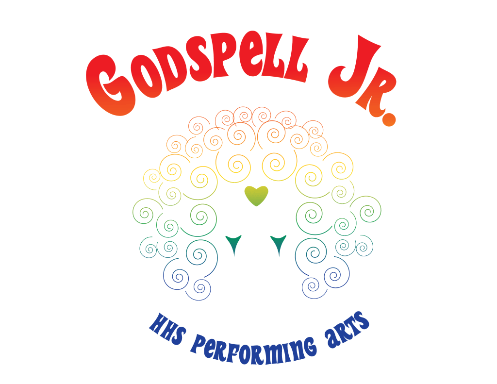
Done as a commission for a former teacher of mine, this design was made to promote their 2021 production of Godspell Jr. It takes cues from the iconic costuming of the 1973 film adaptation with the clown-like makeup and hair.
Green Slate

This logo was a commission done for my brother who at the time was running a small landscaping business in Utah. I aided in both the creation of the logo and other branding elements including the business name.
Mizzou’s Queer Liberation Front
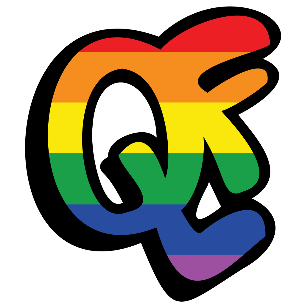
This is a commission done for Mizzou’s queer student association. This rebranding took their old logo, which used a calligraphy font on top of a rainbow gradient that was difficult to read and replaced it with a hand-drawn look incorporating symbols like the actual rainbow pride flag as well as emulating the hand made protest signs seen at Stonewall, alluding to the organization’s history as Mizzou’s oldest queer organization.
Talk of the Town
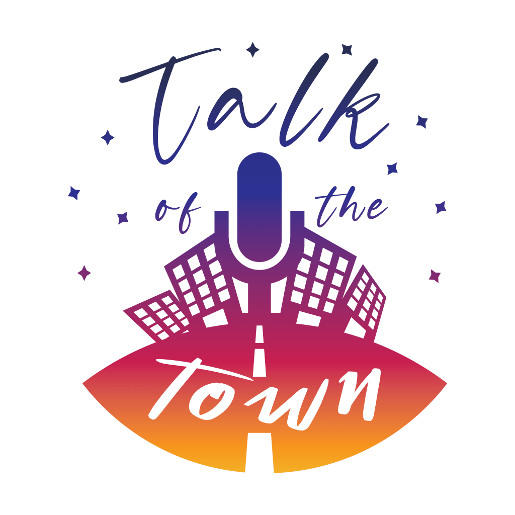
This commission was done for a radio host at local radio station KCOU 88.1FM in Columbia. The show was a weekly talk format focused on highlighting and interviewing interesting people around Columbia. The sunset color scheme was inspired by the show’s evening time slot.
Wine Mom and IPA Dad
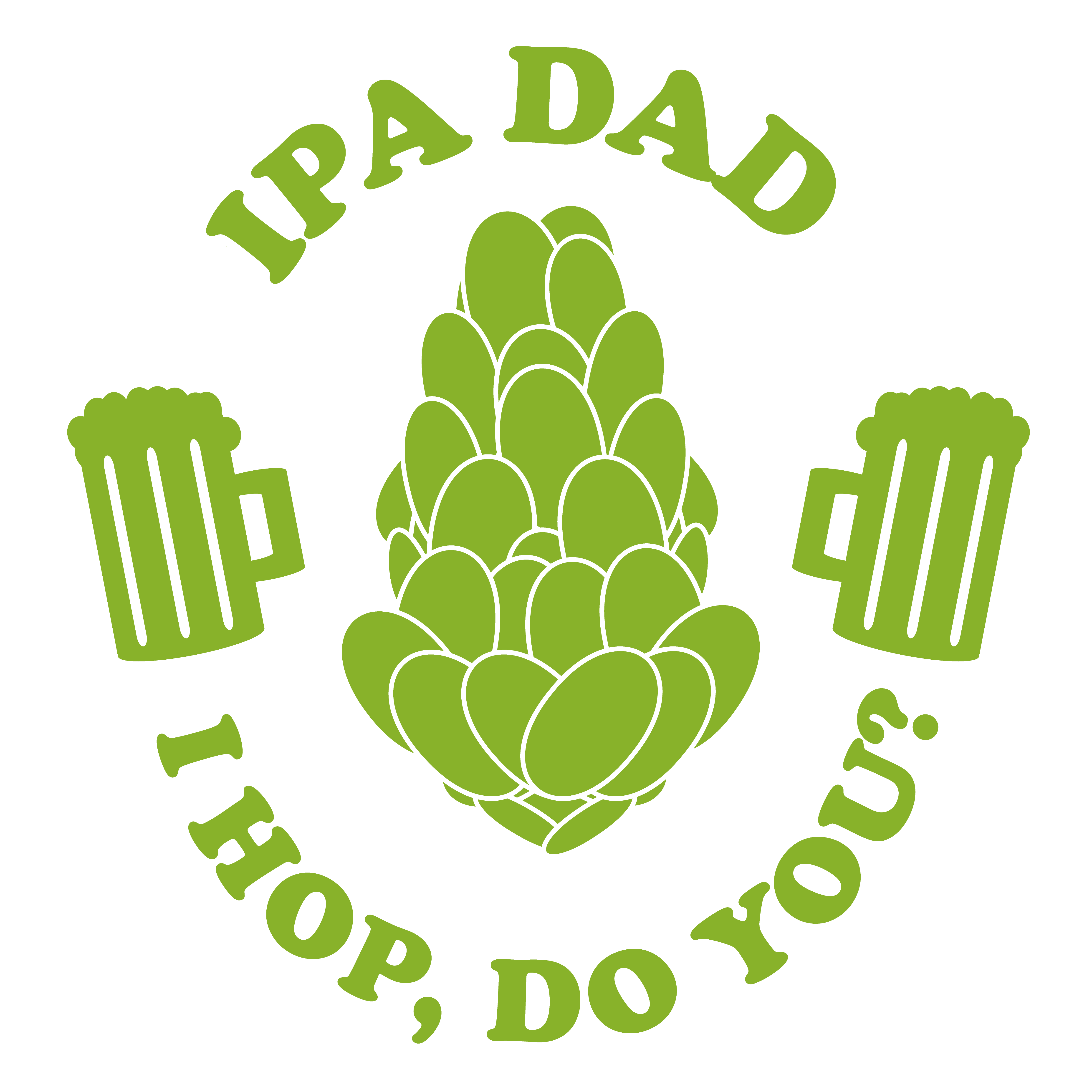
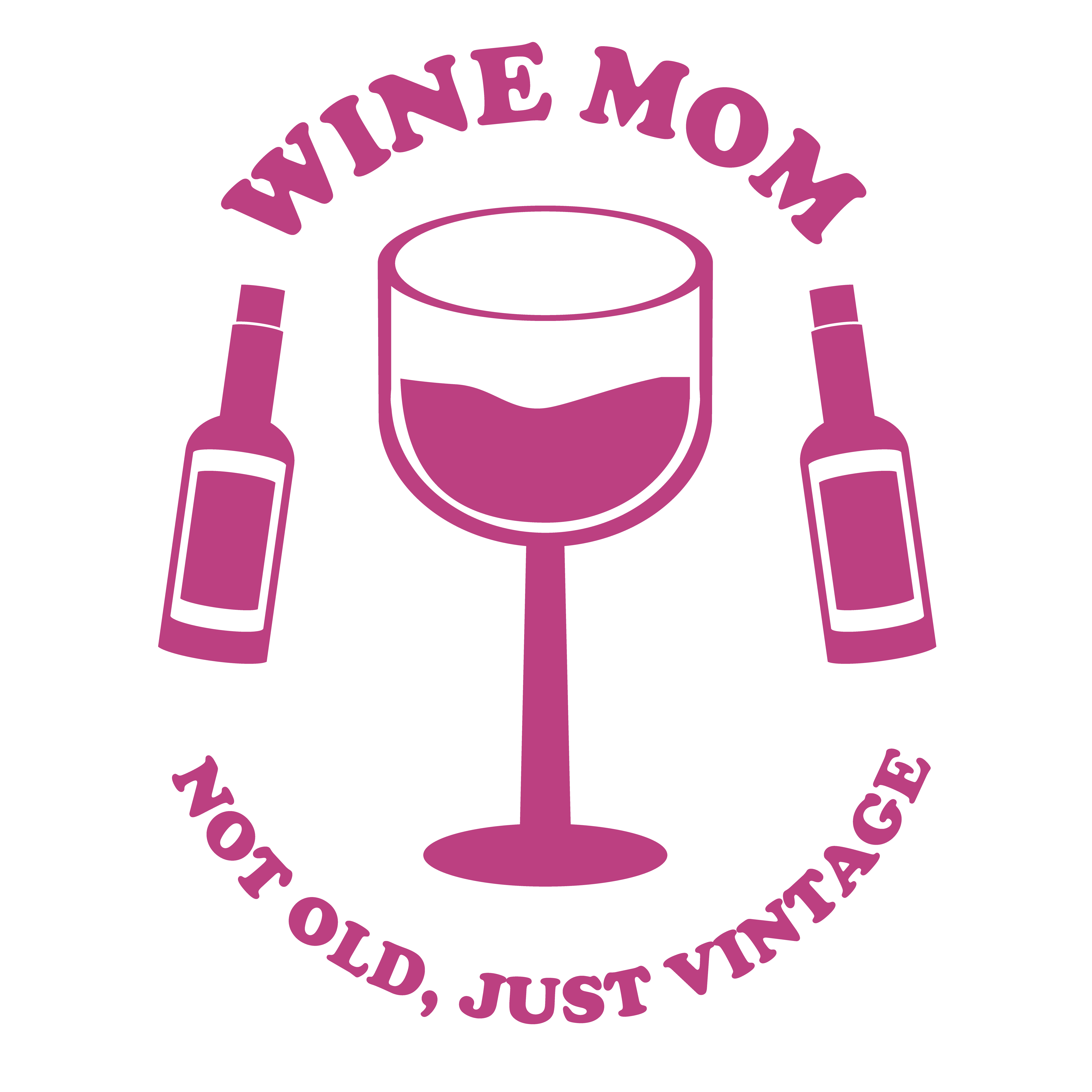
These two logos were designed to be used as stickers or put on t-shirts. I sold them online through Redbubble.
Off Beat
This logo was made as a project for an advertising course. It was made as the logo for our group as an agency. We chose the name Off Beat to express our focus on outside-the-box thinking in our design.
